

Maggie’s Farm
Brand Refresh & Squarespace Ecommerce Website
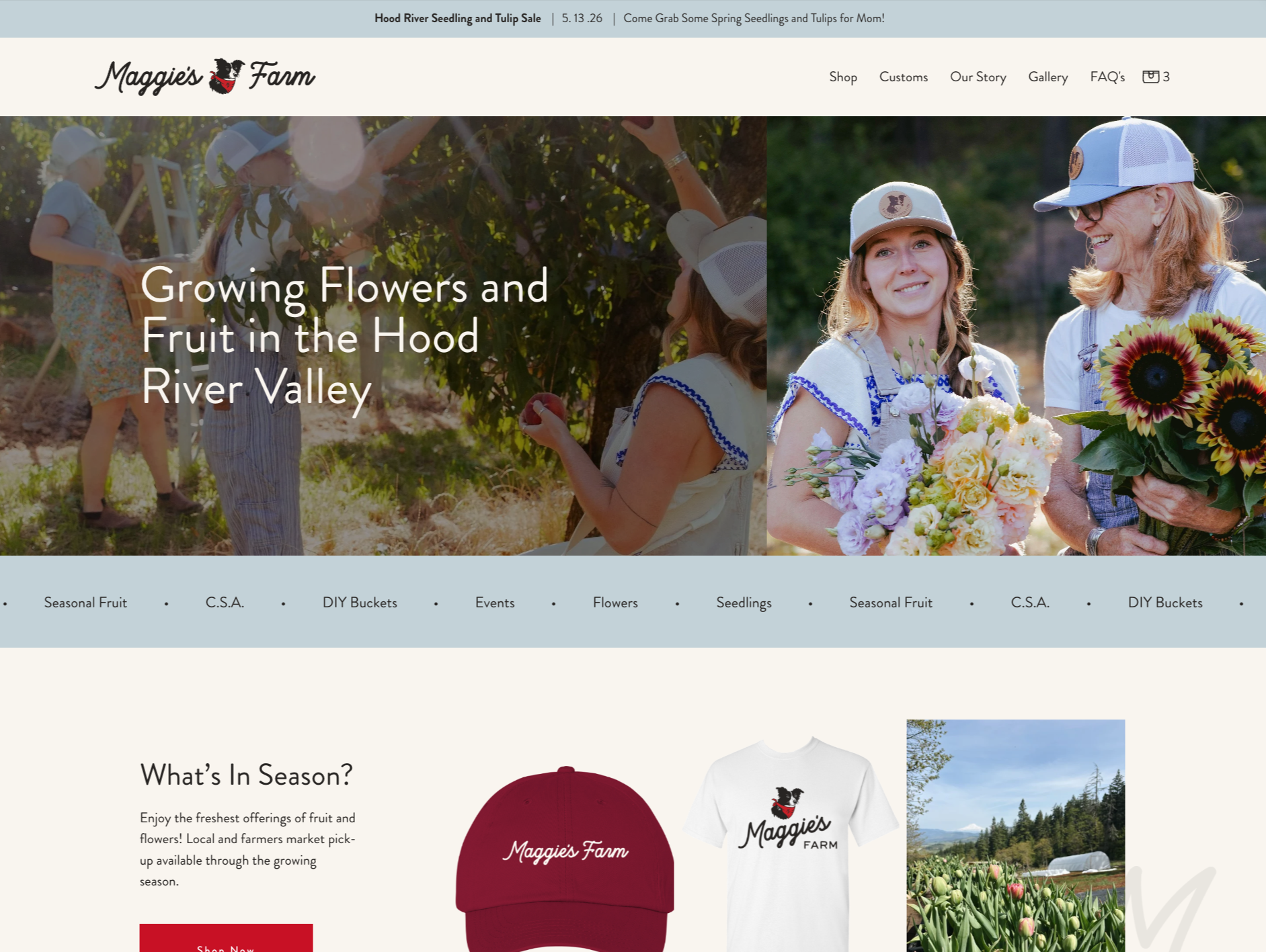
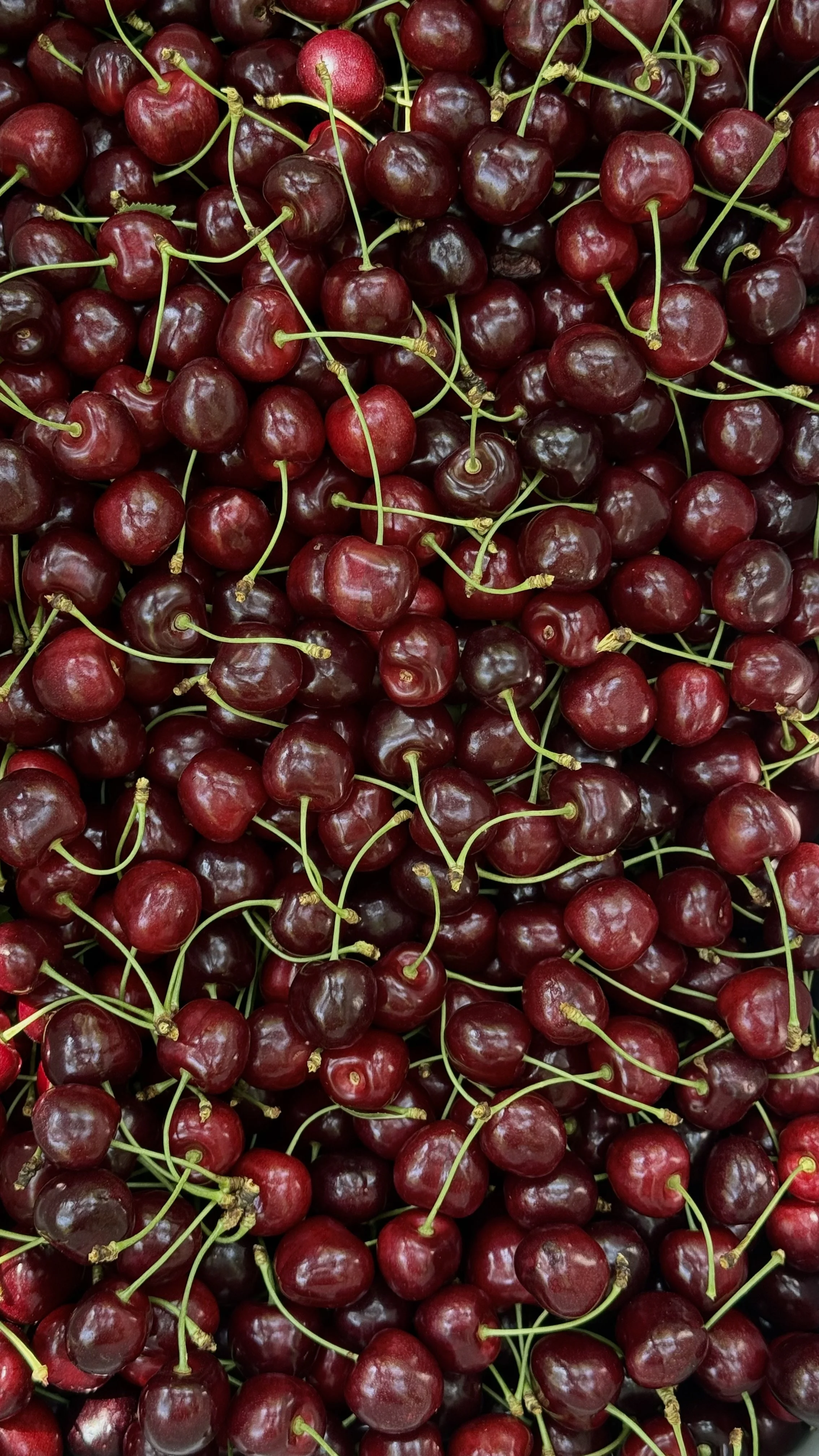
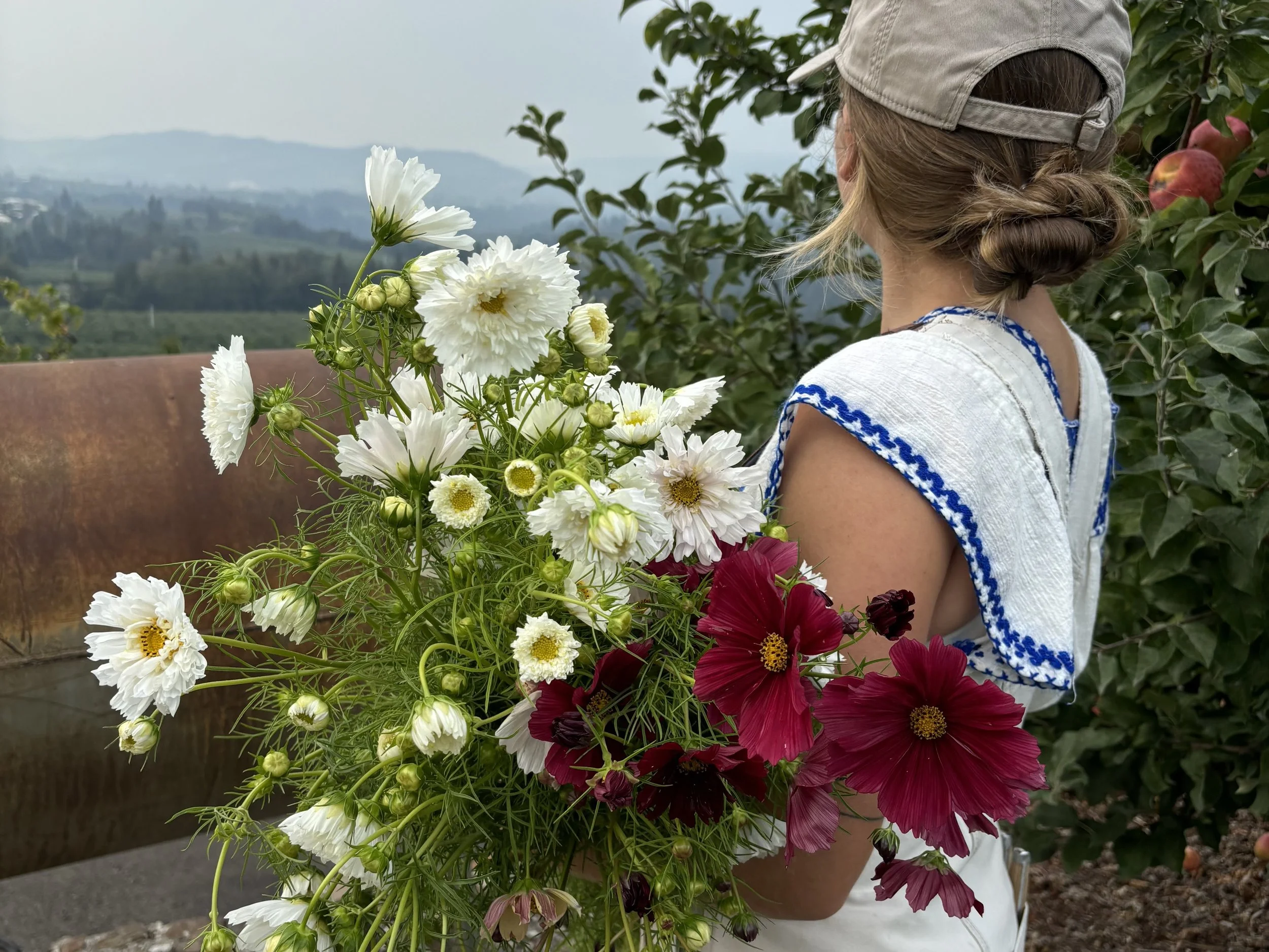
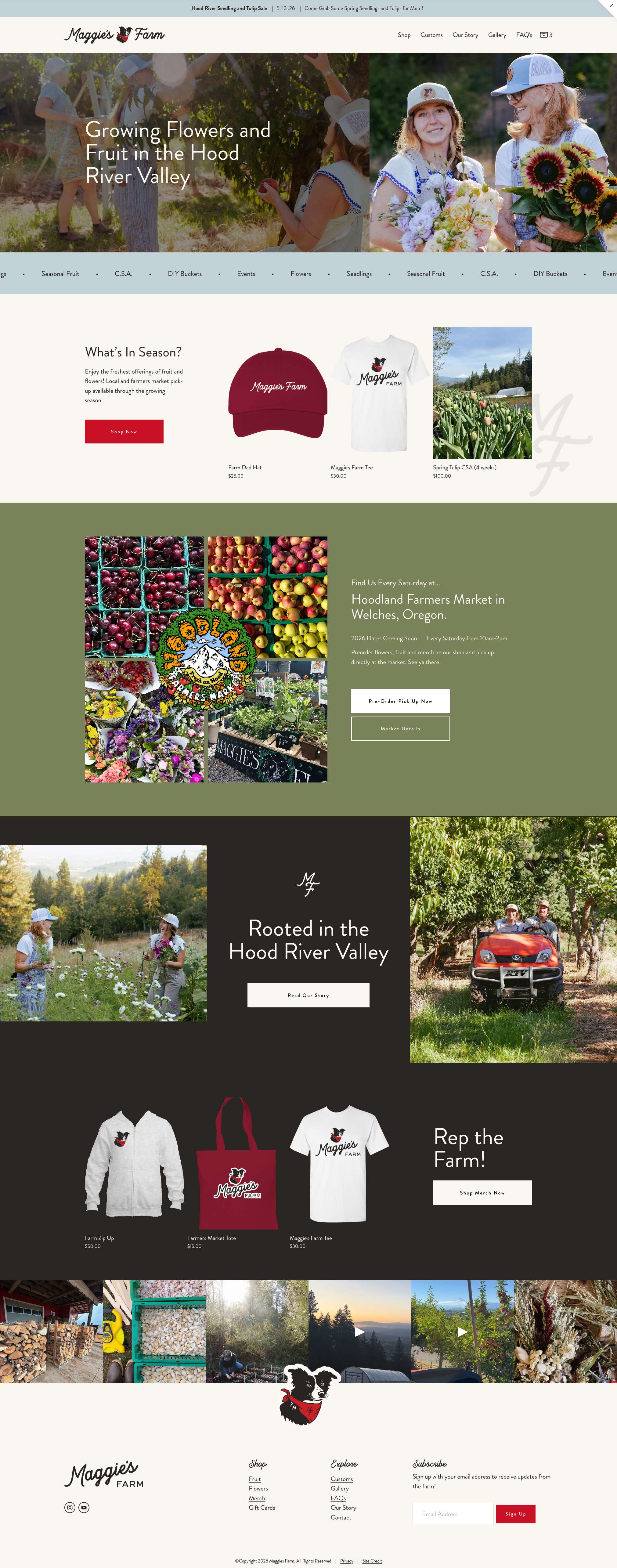
Maggie’s Flower Farm began by growing quality flowers in the Hood River Valley and have expanded their offerings over time to include fruit. As they prepared to become “Maggie’s Farm,” they partnered with us for a rebrand and new ecommerce capable website to reflect their business.
The Rebrand
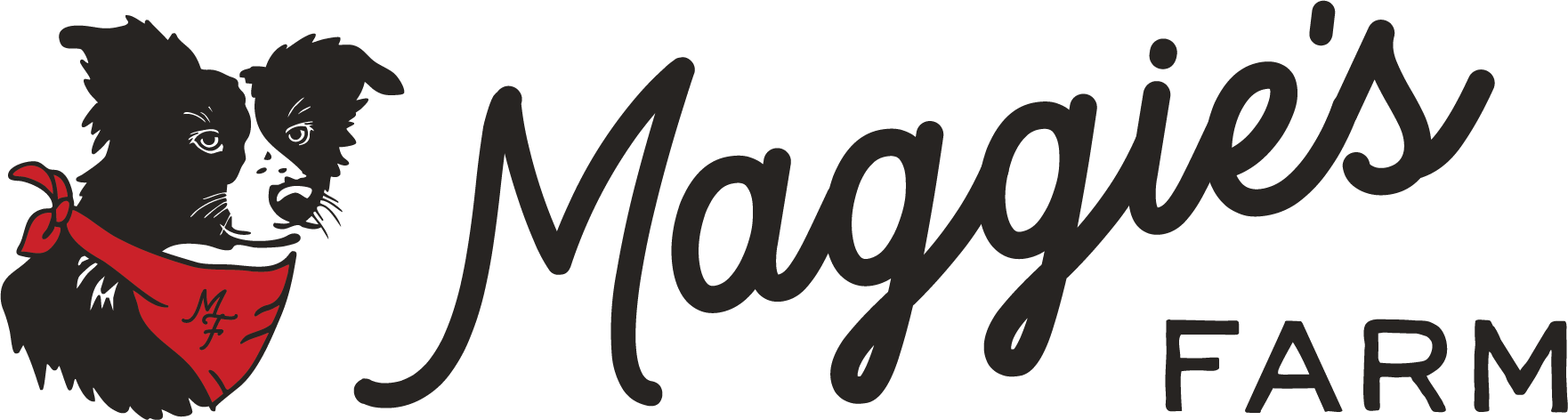
The original logo highlighted their beloved, late dog, Maggie. However, the mark wasn’t flexible at various sizes, layouts and background colors and their business name was difficult to read. Their rebrand requests included creating a brand that was flexible and offered multiple logo variations. Updating the business name from Maggie’s Flower Farm to Maggie’s Farm. And of course, keeping miss Maggie at the heart of the brand. They were after a farm vibe that was clean and clear.
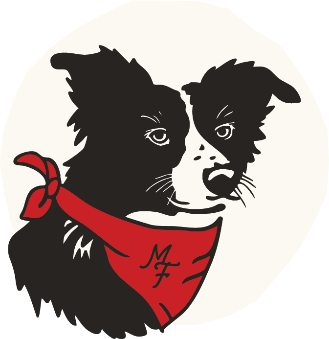
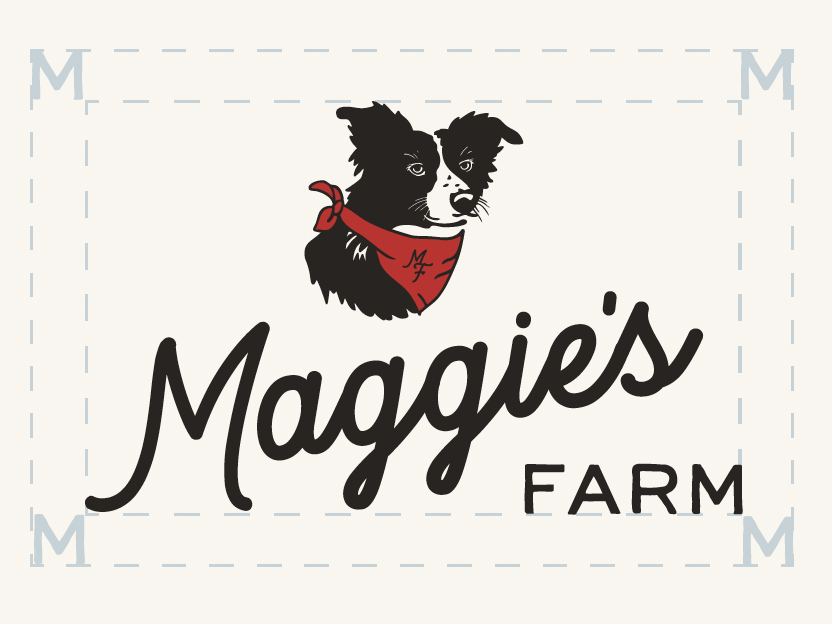
We simplified the Maggie illustration to be legible at smaller sizes and added in some key Maggie traits like her favorite red bandana and nose wiskers. We went with a clean script for “Maggie’s” that offered friendly, farm vibes and paired it with a clean, handwritten san serif for contrast.
Original Logo
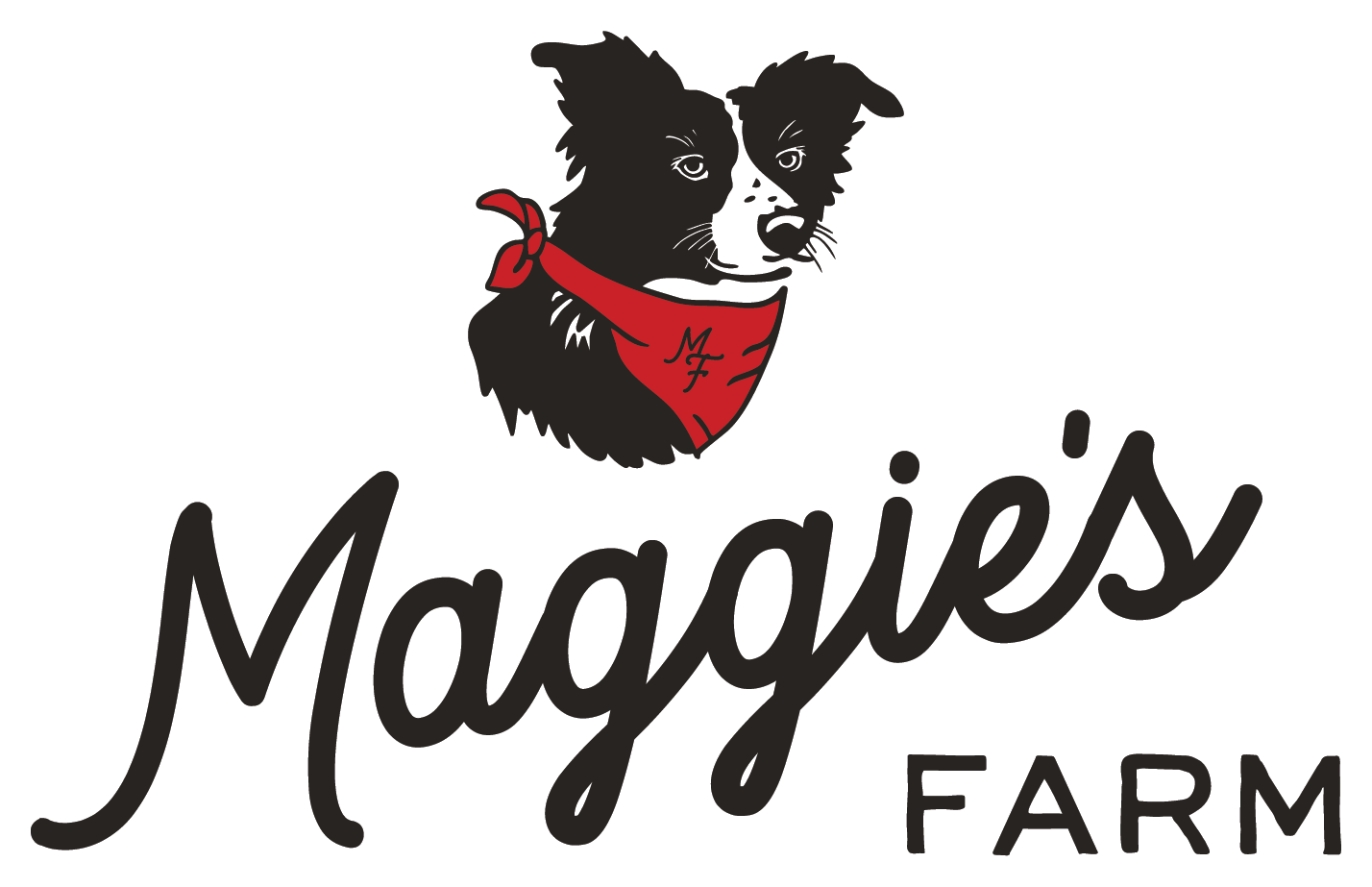
New Logo
Logo Variations
We created a primary logo variation that consisted of a symbol (Maggie) and a wordmark in horizontal and vertical formats. We also made a word mark only option for situations where the full mark can’t be used or when a more simplified logo version is desired for smaller applications or merch variations. The third variation we created was a Maggie only symbol, with no text. This version is perfect for applications where context around who Maggie’s Farm is, is clearly established. Like on social platforms, stickers at their farmers market booth or the website. And finally, we created a MF monogram to use in similar situations where brand recognition is clearly established.

Brand Package
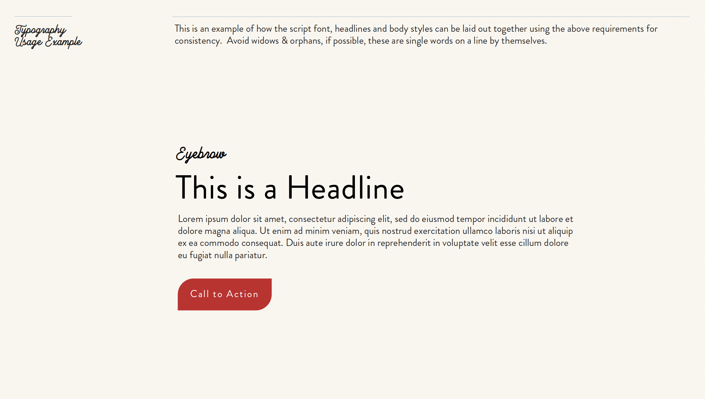
While creating the logo we dove into brand colors and fonts. We wanted to pick a font that we could utilize throughout the website and marketing materials that was accessible and legible, yet paired well with the new logo. Brandon Grotesque was the perfect font for the job. A sans serif typeface that has a functional look with a warm touch. We also decided to the use script font used within the logo sparingly for applications like short accents or eyebrows. Finally, we created a simple brand guide for Maggie’s Farm to utilize when creating new materials moving forward that covers logo usage, typography and colors to maintain brand consistency.

Why Squarespace?
Squarespace is a perfect option for a small business owner, on a budget. The back end is user friendly and easy to update. Once the website is live, you are able to easily update copy and images on your own without needing to hire someone. It has built in SEO to ensure your website is optimized for search. And, it is an affordable, secure option for small business owners looking to have a professional web presence.
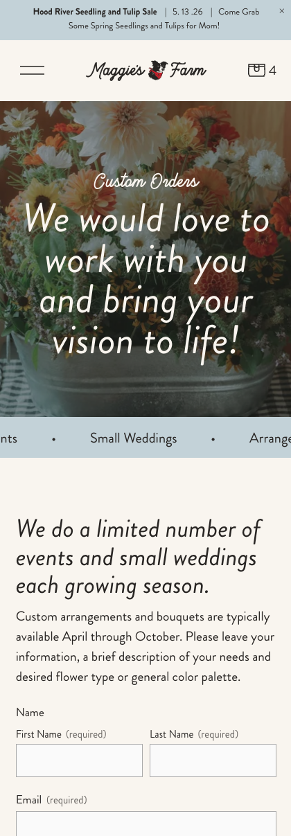
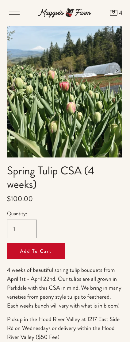
It has ecommerce built in, which was essential for Maggie’s Farm. Their last websites ecommerce gave them numerous issues when it came to fulfillment. They needed the ability to have local pick up and delivery options at checkout per product. Along with offering shipping for merch. Squarespace has all of this built in and is easy to set up and keep up-to-date with real time inventory.
Check out the Maggie’s Farm website in its full glory and the Squarespace packages we offer.
Our Role
Brand Development
Information Architecture
Squarespace Design & Development
Setup of Ecommerce Platform